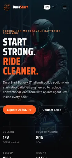
Night Ride
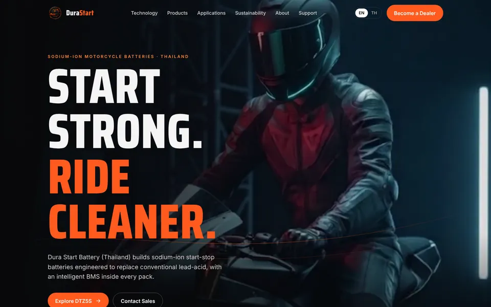
Cinematic and emotional. A full-screen rider opens the page, then a scroll story walks through ignition, the BMS, endurance and sustainability, with the visual changing as you read.

Dura Start Battery (Thailand) Co., Ltd. · Phase 1
Sixteen different directions for the new Dura Start homepage. Each one is a complete, responsive page built with real company and DTZ5S content. Please open each concept on desktop and on a phone, then tell us which direction to take forward, or which parts of different concepts you like.
First round, delivered 28 Oct 2026.
Cinematic and emotional. A full-screen rider opens the page, then a scroll story walks through ignition, the BMS, endurance and sustainability, with the visual changing as you read.
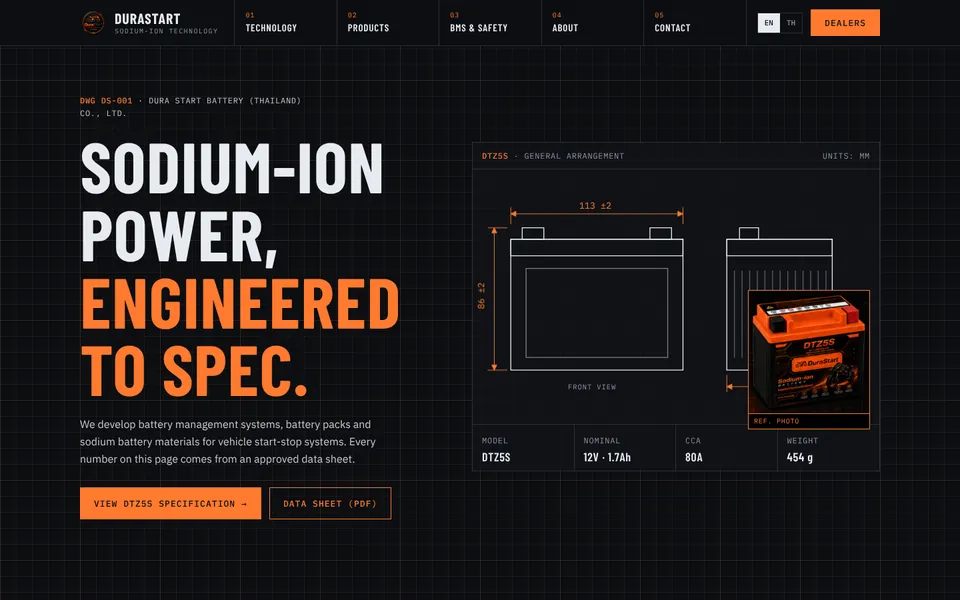
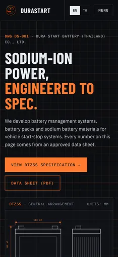
Engineering credibility first. A technical-drawing language with an animated dimension drawing, numbered "sheets", the full DTZ5S specification table and a BMS block diagram.
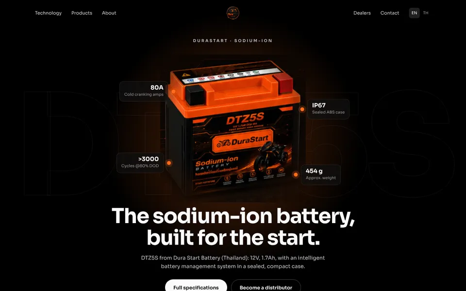
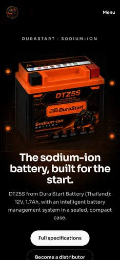
The battery is the hero. A centred DTZ5S with spec hotspots, then a pinned "look inside" sequence from case to cells to BMS, like a premium product launch page.
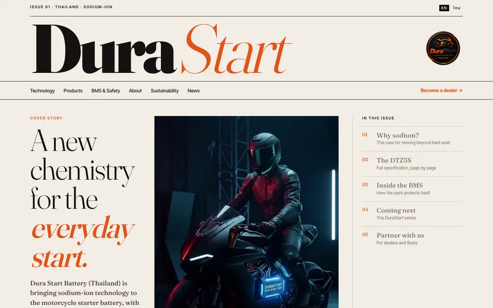
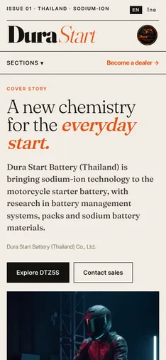
A magazine cover for a new chemistry. Warm paper tones, serif headlines, a contents column and a feature essay. The most distinctive option and the furthest from a typical battery site.
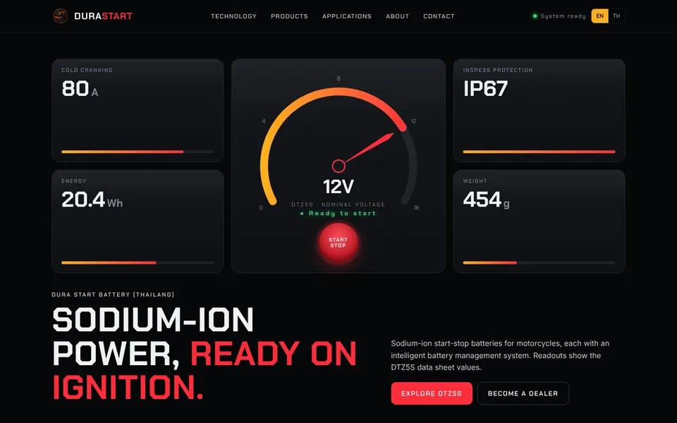
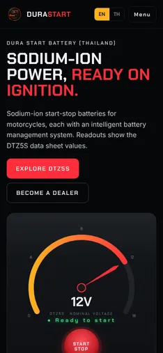
The homepage as a motorcycle dashboard. An animated voltage gauge with a start button, readout panels, a tabbed spec "menu" and an operating-temperature chart.
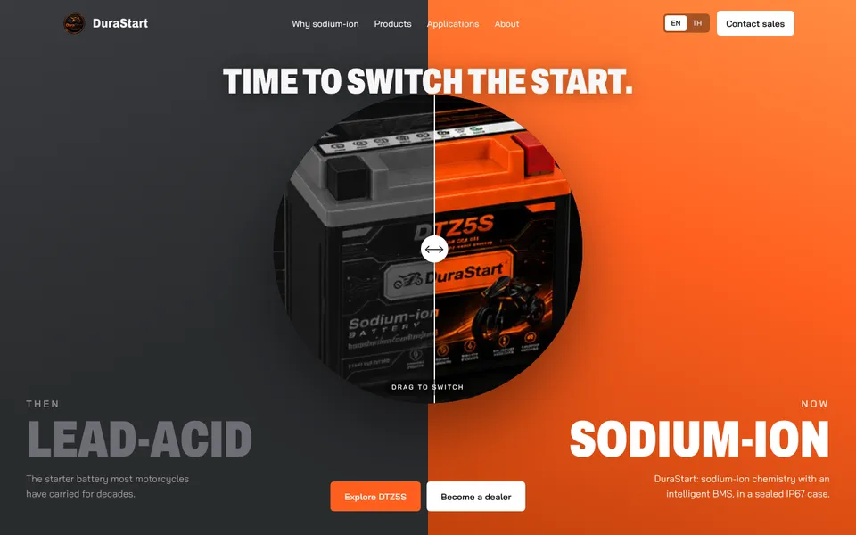
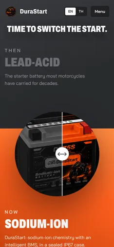
A "make the switch" story. A split-screen hero with a drag-to-compare product, then reasons to switch and a side-by-side table. The lead-acid comparison values need client input before launch.
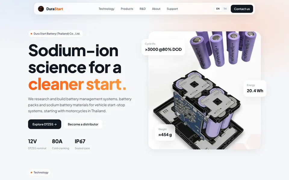
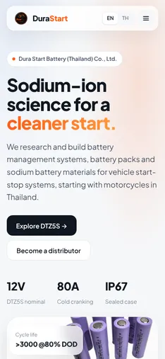
Clean, bright and scientific. A floating glass navigation, cells and BMS imagery, a bento grid of facts, an R&D section and an inquiry form with consent. The light-mode alternative.
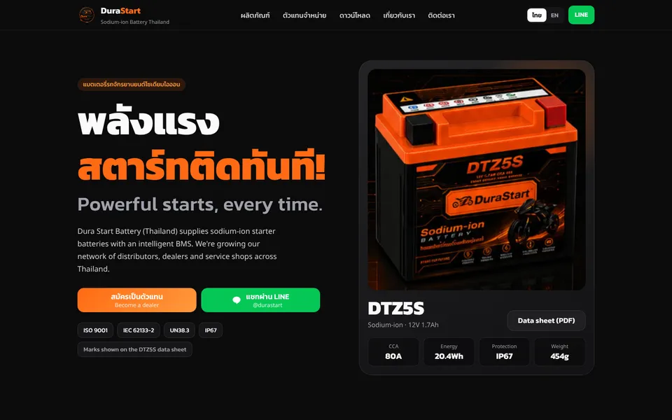
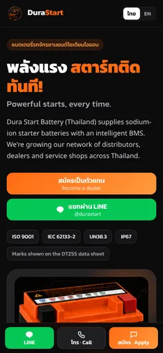
Built for dealers and service shops on their phones. Thai-first, LINE at the centre, a sticky mobile action bar, partner-type tabs, talking points for the counter and the full dealer form.
Second round, eight new directions.
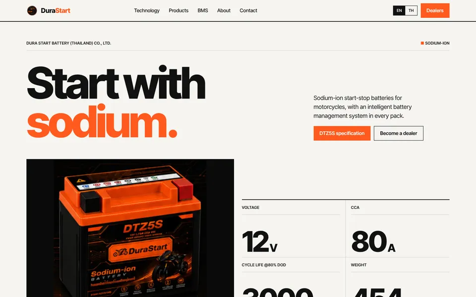
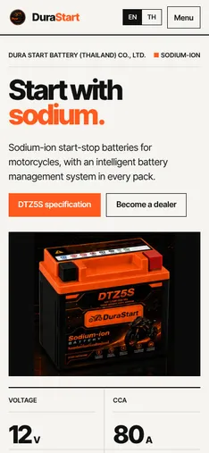
Strict 12-column International Typographic Style on warm white. Huge numerals, hairline rules, one orange accent and an orange partner block. Calm, confident and very readable.
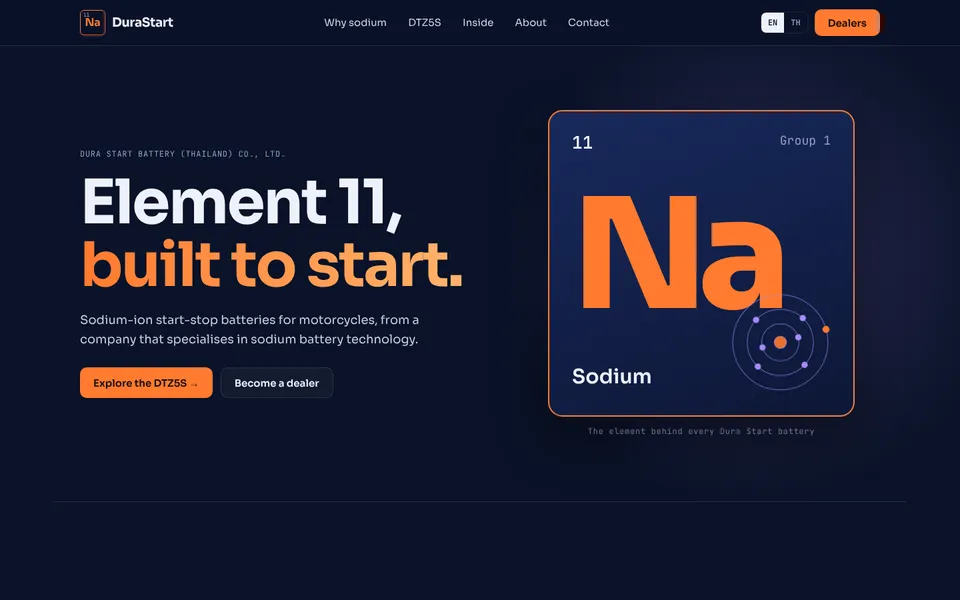
Chemistry-led. A periodic-table tile for sodium opens the page, and the DTZ5S data sheet becomes a colour-coded "table of elements" with one tile per value.
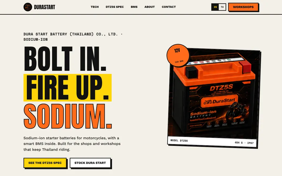
Neo-brutalist and made for mechanics. Hazard-tape marquee, chunky borders and hard shadows, a printable "job card" spec and a fit-check panel with case dimensions.
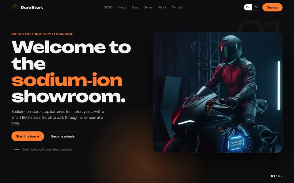
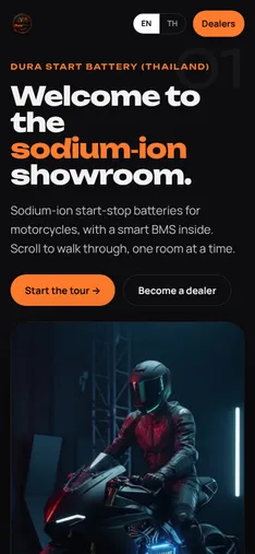
Scrolling down moves you sideways through seven showroom "rooms": rider, battery, inside, spec, series, company and contact, with a progress bar. Stacks vertically on phones.
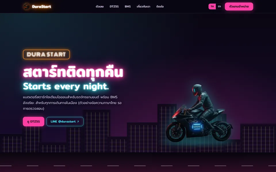
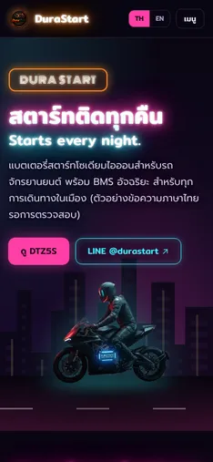
Thai-first night city. Neon-sign headlines, a CSS skyline with the rider on the road, glowing stat signs, night-market stalls for the series and a big LINE QR sign.
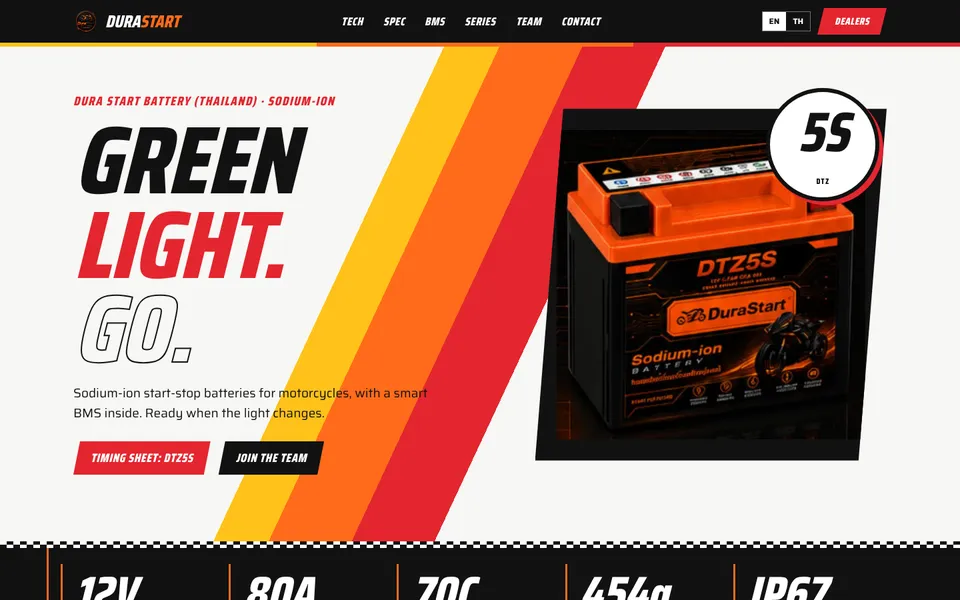
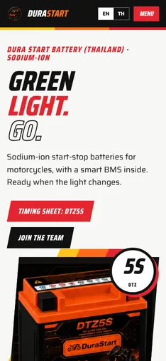
Motorsport styling with yellow-orange-red livery stripes, a "5S" race plate, a pit-board stat bar, a tabbed "timing sheet" spec and a starting grid for the series.
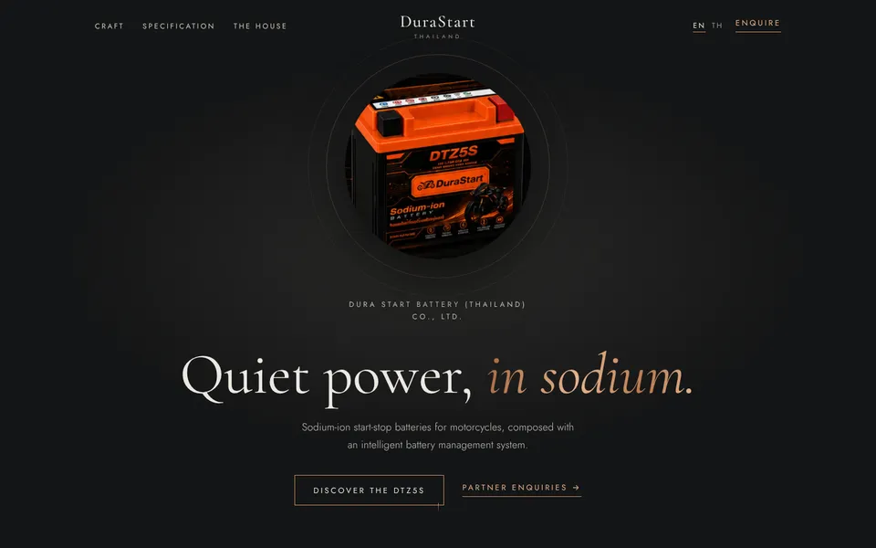
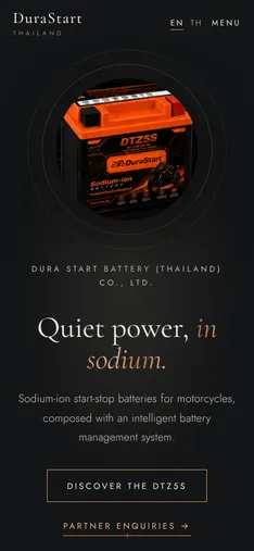
Quiet luxury. Graphite and brushed copper, an elegant serif, slow reveals and lots of space. The spec sits in refined accordions; mission and vision become large quotes.
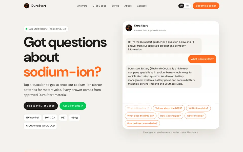
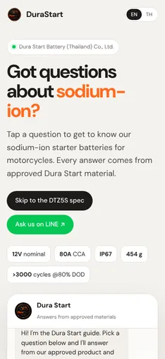
A friendly question-and-answer homepage. Visitors tap questions in a chat window and get scripted answers from approved content, followed by short answers, the full spec and LINE.